The Soap Dispensary & Kitchen Staples
WEBSITE REDESIGN
Identifying and analyzing the current website limitations of a Vancouver based refill zero-waste brand and redesigned the same for a tailored and streamlined shopping experience while building trust and motivation among customers for a mindful zero-waste lifestyle.
My Role
UX/UI Researcher & Designer
Team
Ashima Mittal & Erin James
(Student Project)
Duration
Jan 2022
(10 Weeks. total)
Significant Personal Contribution
Discovering insights through secondary research, interviews, affinity and experience mapping, designing the revised user-flow and IA, testing and iterating for a well-rounded design.
Toolkit
Pen & Paper, Miro, Figma, Illustrator, Photoshop, Optimal Workshop, Useberry, Zoom
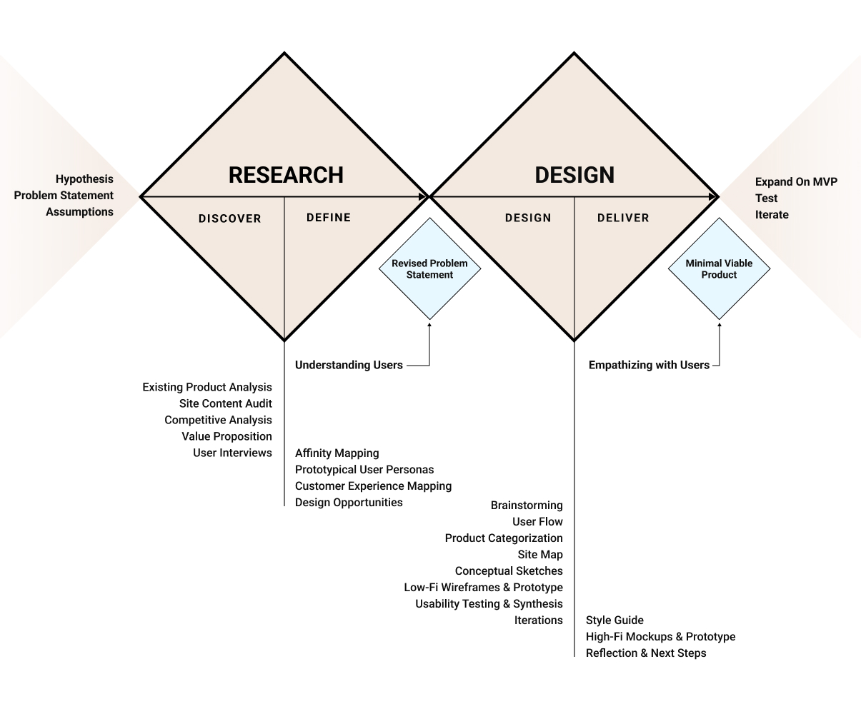
Our design process followed the Double Diamond and Lean UX Approach to identify and incorporate high value tasks to successfully deliver a Minimal Viable Product (MVP) for validation and to work synchronistically in team throughout all stages of project evolution.
01. OVERVIEW
Packaging waste forms the most dominant share in the world’s solid waste pollution, with an estimated 8 million tonnes entering the oceans each year. This is where sustainable brands like The Soap Dispensary are stepping up and need impactful design and business strategies to truly make the difference they intend to.
Problem
The Soap Dispensary is trying to challenge the trends of mindless consumption and toxic packaging. However, they do lack a strong online presence and their current website is extremely difficult to navigate with minimal to no education around zero-waste.
Initial Hypothesis
People lack motivation to opt for zero-waste products because of :
- unorganized information, complex navigation, and inconsistent visual style adds to the discouragement.
- limited awareness and knowledge around the subject of zero-waste.
- increased initial cost and limited availability compared to conventionally packaged products.
- perceived complexity around package free shopping process.
- inability to see personal and environmental value in opting for zero-waste.
Solution
01. Streamlined shopping experience through clear navigation and progressively disclosed information to minimize cognitive overload.
02. Robust filtering system to provide narrow and focused search capabilities.
03. Higher approachability through multiple elements of affordability and convenience.
04. Impactful, tailored, and easy to understand information around zero-waste and how to shop for the same.
05. Trust and credibility through impactful brand story, values, and ethics with consistent visual style and inviting tone of voice.
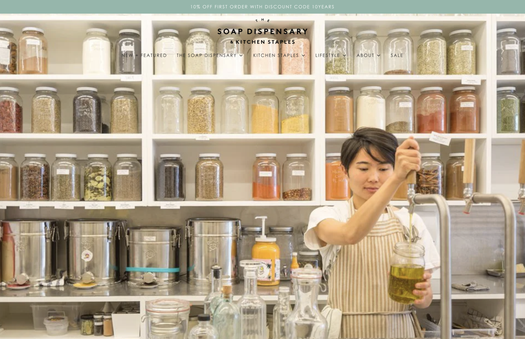

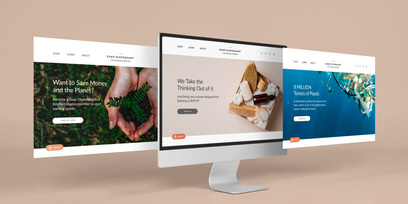
Before (left) and After (right) - Home page design preview
How we got here?
Let's walk through the Design Process
02. DISCOVER
Research Goals
01. Investigate and analyze current website design and customer experiences – Website Audit.
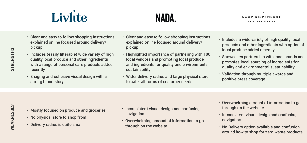
02. Identify direct competitors and identify Unique selling point (USP) – Competitive Analysis.
03. Discover target audience’s current behavioural patterns and motivations when shopping for everyday essential needs and their knowledge and experiences with zero-waste refillable products – Interviews, Affinity Map, Personas, and Customer Experience Map.
Website Audit
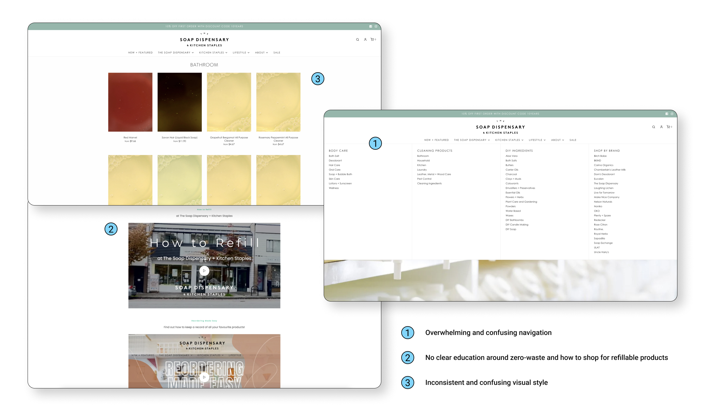
We initiated our research with a thorough website investigation and identified key issues, like:
- overwhelming and confusing navigation
- no clear education around zero-waste and how to shop for refillable products
- absence of a strong and impactful brand story
- inconsistent UX and visual design
User Interviews
Interviews being the most valuable methodology to extract qualitative feedback, we conducted interviews with 4 participants (equal ratio of male to female within the age of 25 – 35, all economically active and living in Vancouver with different brand loyalties and shopping preferences) to understand their challenges, current behaviours, motivations, and knowledge around zero-waste and received valuable insights validating and adding to our initial hypothesis.
I’m not sure if I see the benefit in buying package-free products when they are just more expensive than what I am currently buying.
I am interested in using more zero-waste products in my everyday life, but I need more information about how and where to start from.
03. DEFINE
Affinity Mapping
After collecting feedback from interviews, we conducted a collaborative sorting exercise to identify and group common themes and patterns into respective categories using an affinity diagram. We then analyzed and listed these categories in order of priority to define most impactful insights with customer and business goals.
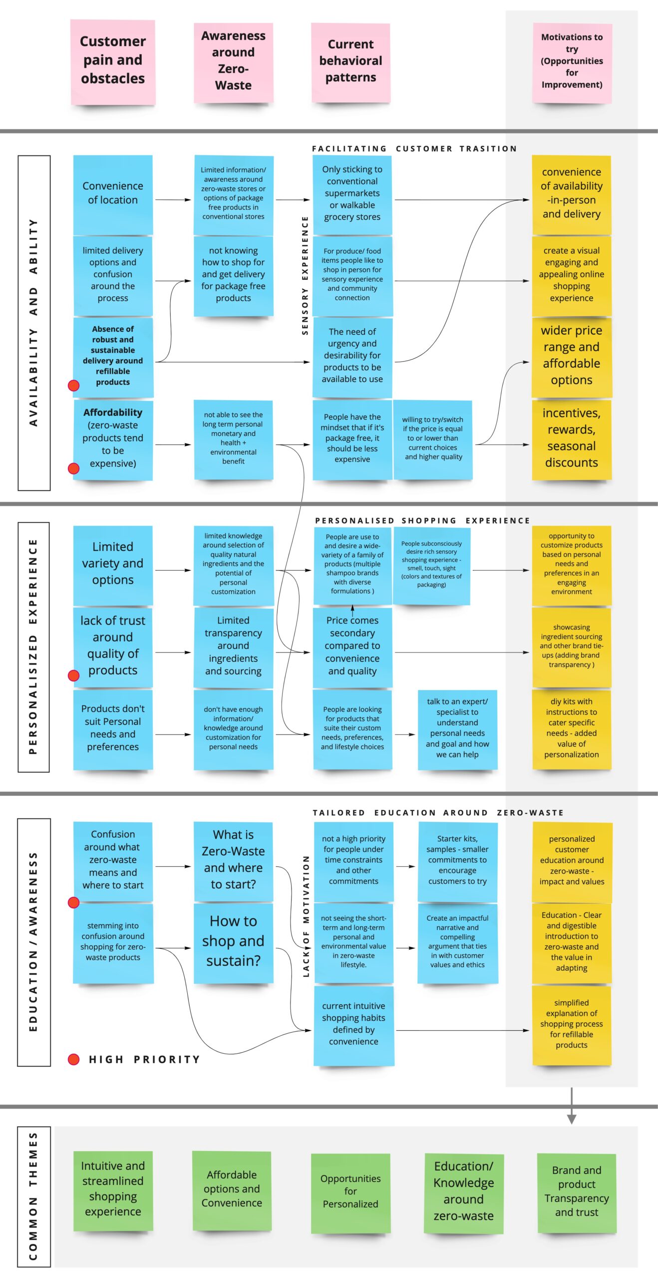
Research Insights
01. Motivation
Affordability and convenience were the top motivating factors for all participants when shopping for everyday needs.
02. Awareness
Lack of awareness and clear understanding around zero-waste added to the perceived complexity around the subject.
03. Convenience
A seamless shopping experience that supports delivery would encourage to try and transition to zero-waste product.
Customer Goals
01. A streamlined and intuitive shopping experience.
02. Affordable and convenient to buy quality products.
03. Tailored and easy to understand information around zero-waste – what, why, where, and how?
Business Goals
01. Gain customers while minimizing churn-rate.
02. Build trust and credibility among customers.
03. Become leading advocates in the zero-waste community protecting the environment.
Building Empathy
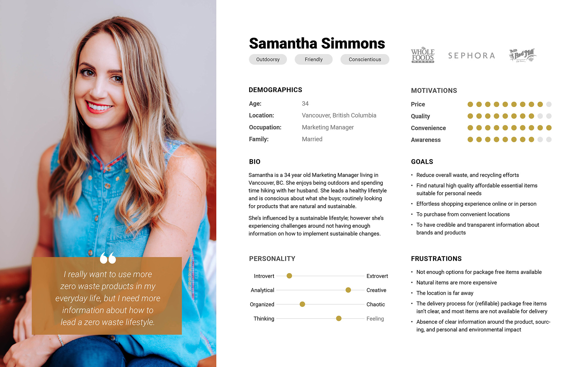
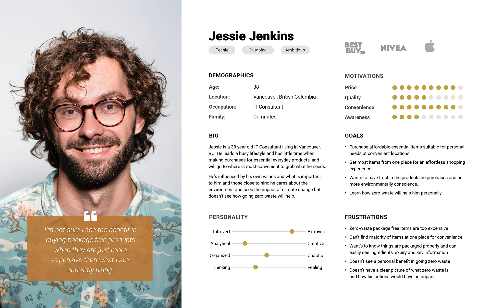
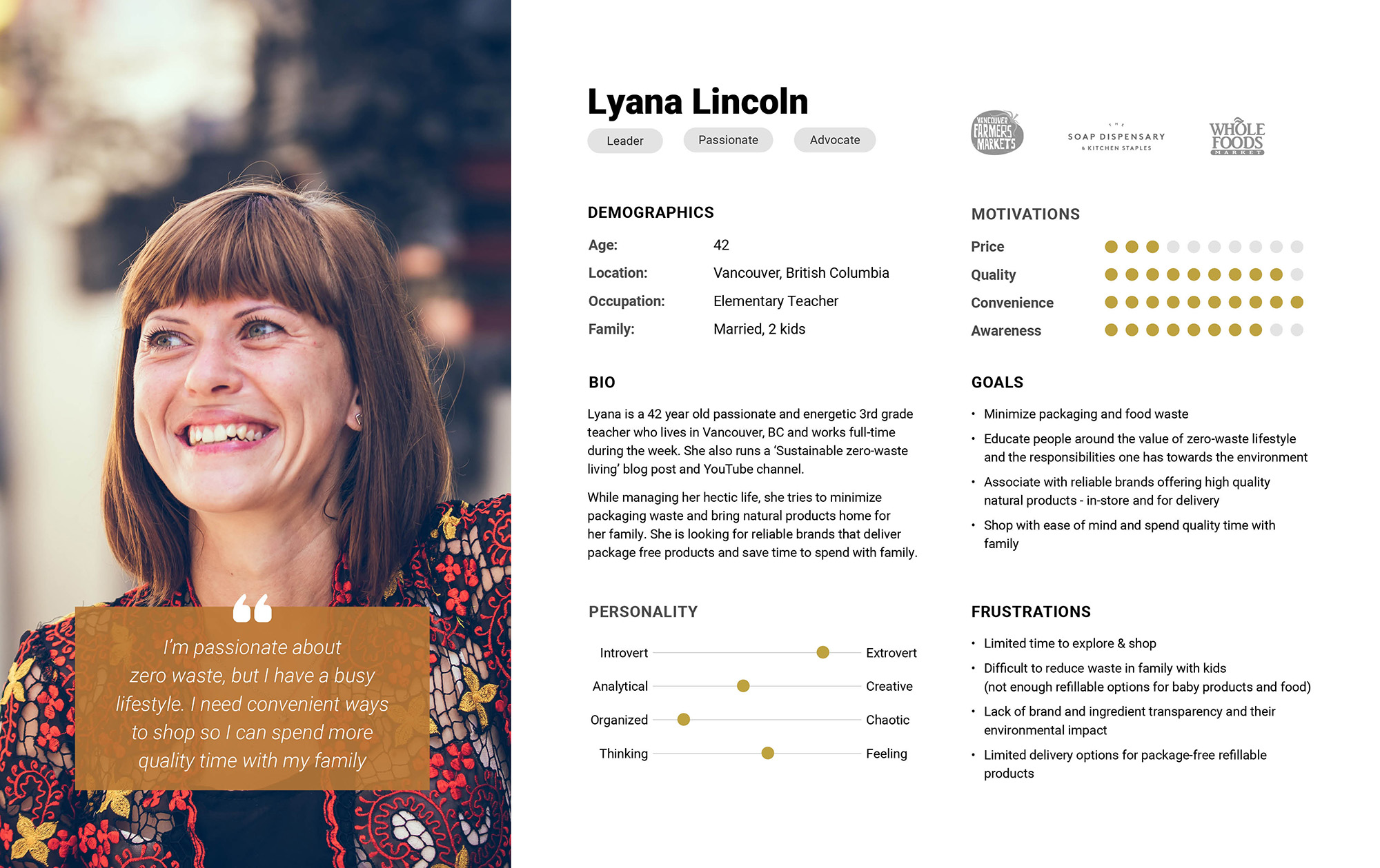
Using all the secondary research and interview insights, we validated and strengthened the initial hypothesis listing frustrations and goals of our target audience and defined three distinct Prototypical Personas – Jessie Jenkins (the beginner), Samantha Simmons (the inspired middle), and Lyana Lincoln (the advocate).
We decided to focus on the persona of Samantha Simmons to further base our research and design on, as she shares common frustrations with the other two and has the motivation to start her journey in zero-waste but lacks the education and resources to do so.
Customer Experience Map
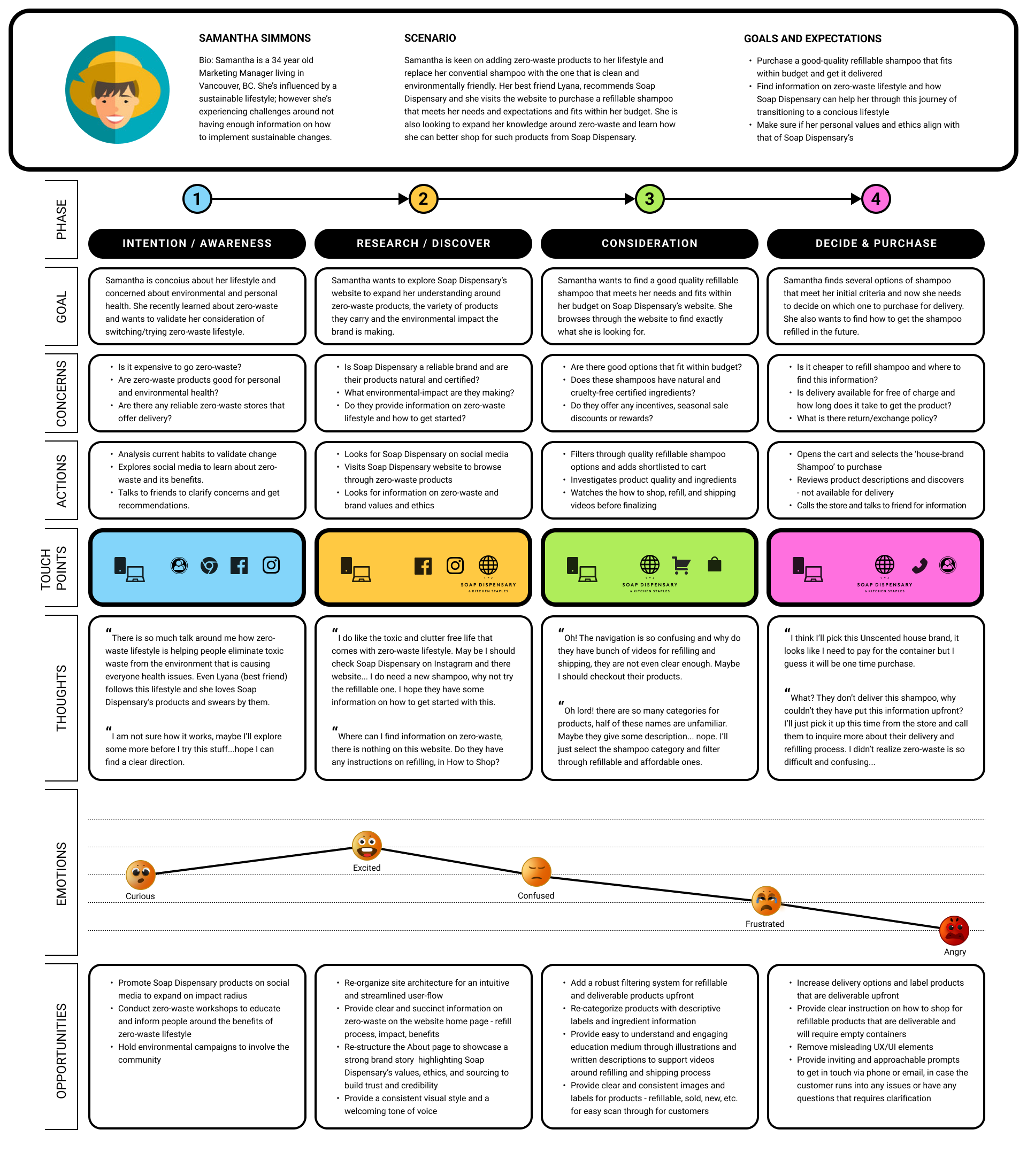
To better understand the experience when customers interacted with the current Soap Dispensary website to shop for zero-waste refillable products, we developed the Customer Experience Map.
The scenario for the journey is based on the persona of Samantha Simmons, who finds multiple motivations – personal and environmental – to start her journey in zero-waste lifestyle. She visits the website to buy a refillable shampoo and expand her knowledge around zero-waste. However, she is soon confused by the inconsistent navigation and disappointed by the absence of critical information around value and impact of zero-waste and the process of refilling.
Revised Problem Statement
Before defining any design opportunities, we synthesized all findings and insights to revise the Problem Statement and better align with project goals.
HOW MIGHT WE...
motivate and sustain higher customer engagement and increased customer trials through streamlined shopping experience and impactful zero-waste education?
Opportunities for Improvement
All our research and analysis so far, especially the Customer Experience Map, helped us in identifying significant gaps and issues with the current website, directly defining and formulating most impactful opportunities to resolve major customer pain points:
01. Seamless Navigation
Restructure and organize the overall website and main navigation content to minimize cognitive overload and provide an intuitive flow for customers to help them easily find what they are looking for. Adding a robust filtering system to help narrow down search and remove time-consuming frictions further streamlining their shopping experience.
02. Affordability - New Business Model
Introduce and showcase new business model of incentives, rewards, seasonal discounts, monthly subscriptions, and reduced priced custom kits for starters to balance the overall initial cost. Highlight quality, health, and environmental benefits associated with these products to further add to customer motivation.
03. Convenience
Simplify and clearly provide easy to follow instruction to shop for zero-waste refillable products, both in-store and online facilitating a smooth shopping experience encouraging more customers to shop hassle-free. Also, the custom designed kits add motivation to buy without a huge financial and time commitment with a touch of personalization.
04. Impactful Zero-Waste Education
Educate and inform customers around the process, need, value, and implementation of zero-waste lifestyle and how it can help them live a toxin-free healthy life while protecting the environment from waste pollution, through statistical and fact-based data to build trust and induce motivation.
05. Build Transparency and Trust
Build and highlight a strong brand story showcasing the impact Soap Dispensary is making in the community through their values, ethics, sourcing, ingredients used, and local business partnership. Reinforce the sense of trust through consistent and appealing visual style complemented by an inviting tone of voice in the copy content on the website.
04. DESIGN
Brainstorming & Sketching
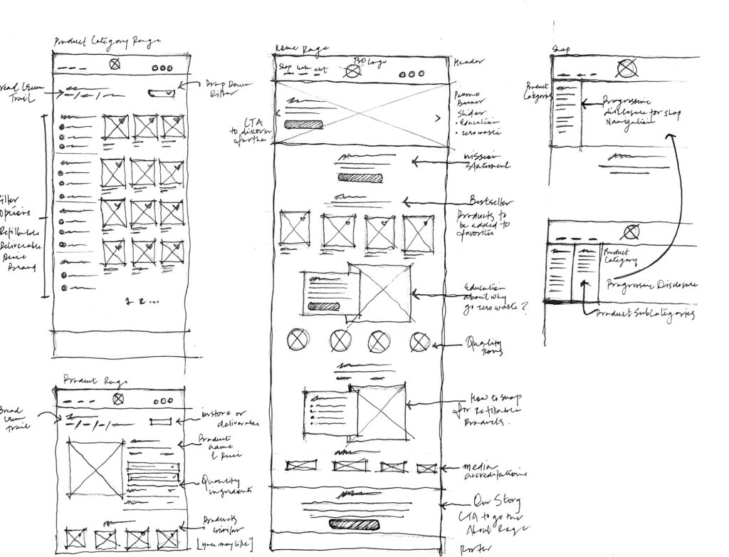
Leveraging research findings, insights, and design opportunities, we then sketched ideas to map out the site structure focused on the home page, navigation, and subsequent shopping and checkout page layouts.
User Flow
We then jumped into developing an improved user-flow to better empathize with Samantha and the journey she will take to complete the key identified task. The user-flow laid the foundation for revised site architecture and design ideas implemented in the wireframes.
Scenario – Samantha visits the Soap Dispensary’s website to buy a refillable shampoo and expand her knowledge around zero-waste.
Product Categorization for Improved IA
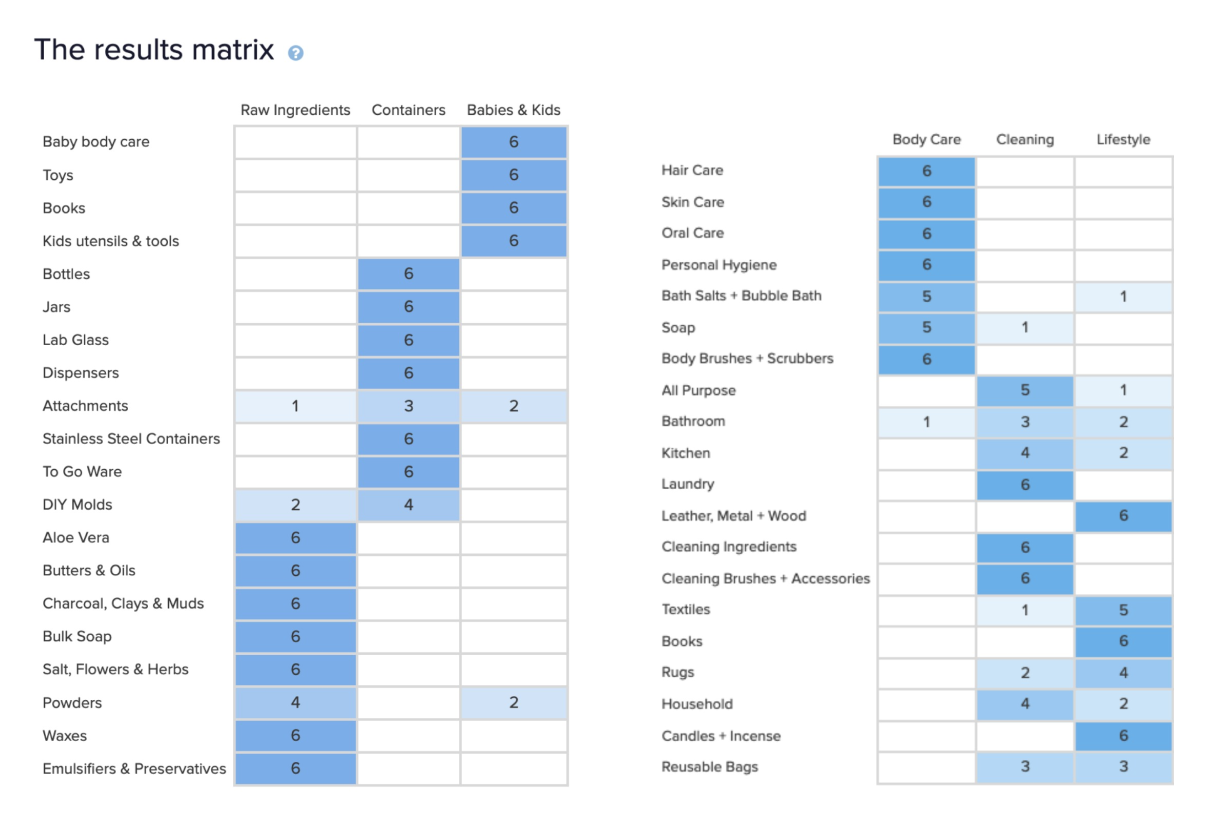
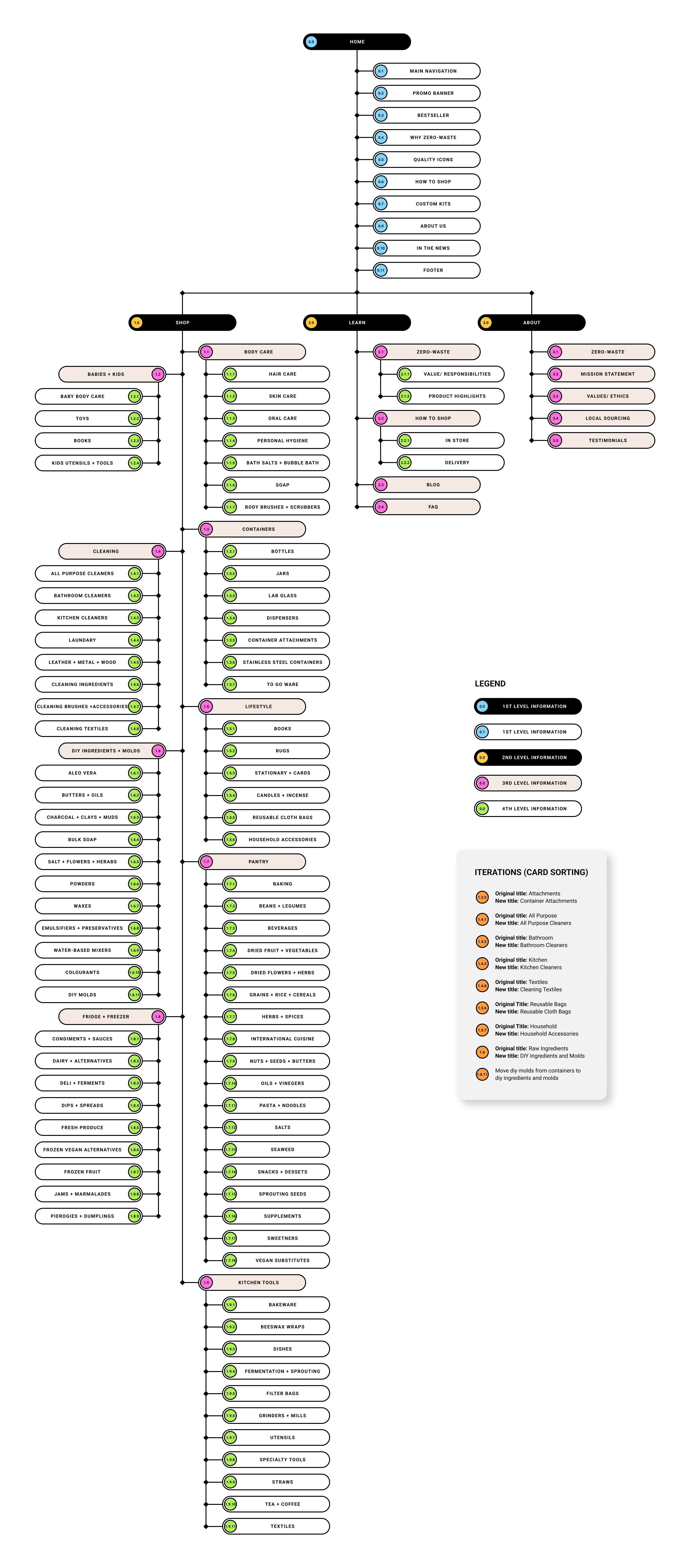
We documented all product available on the website and relabeled them with descriptive names and recategorized products that logically belong to certain categories for an intuitive navigation. We then conducted a card-sorting exercise with 20 participants to test and validate revised labeling and categorization. The results were highly positive with minor discrepancies that we analyzed and iterated on for improvement.
Revised Site Map
We incorporated the revised product categorization and re-structured the site architecture to address the issues of missing information and inconsistent navigation. We heavily focused on structuring the home page to tell a narrative of Soap Dispensary as a brand and present a convincing case for a zero-waste lifestyle.
Low - Fidelity Wireframes and Prototypes
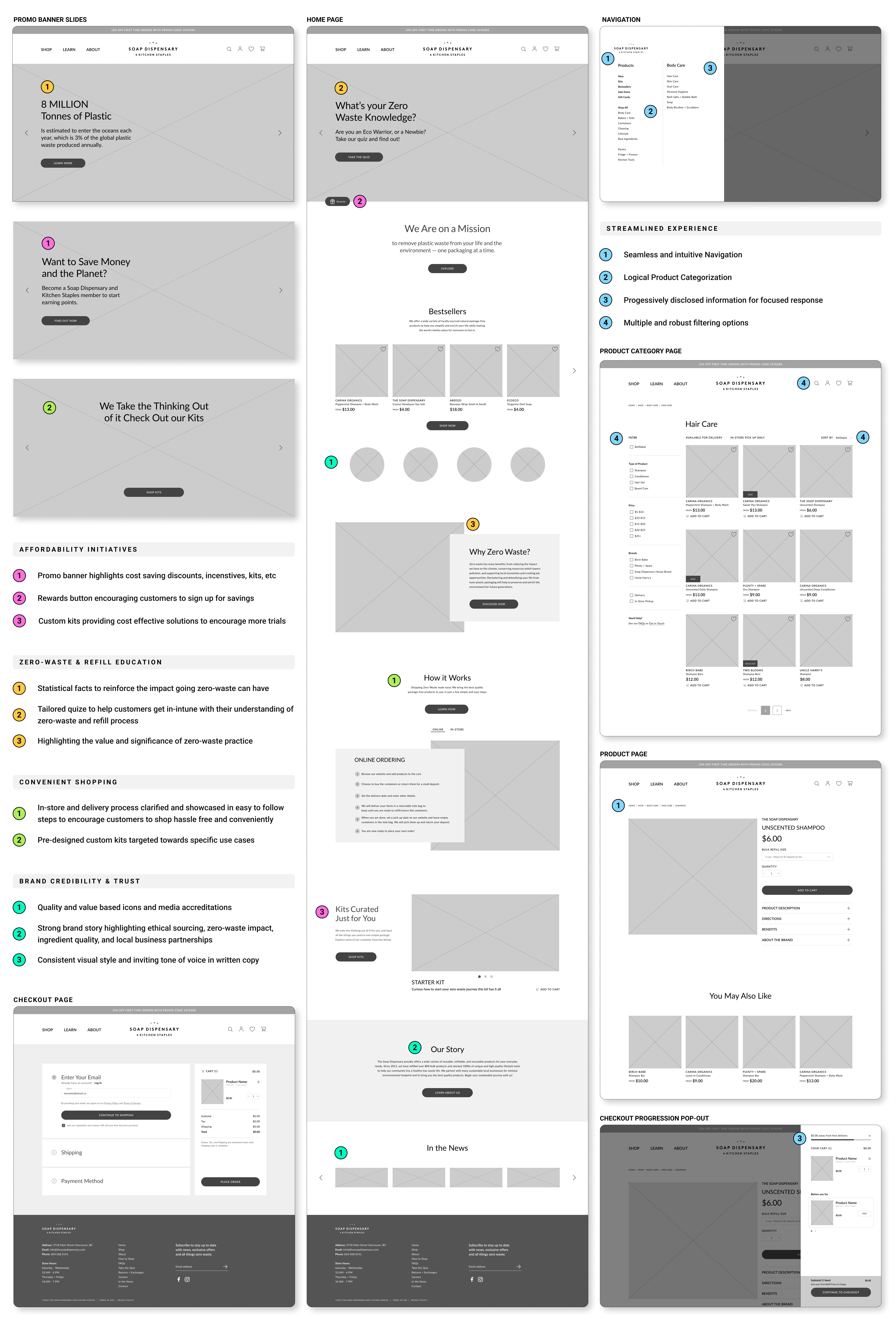
We then collaborated to identify and implement most valuable features and ideal user-flow into the wireframes using Figma. We utilized customer and business goals as guiding principles for successfully incorporating design opportunities to develop refreshing and minimalist clean UI design that conveyed trust, credibility, and ease of use.
Usability Testing
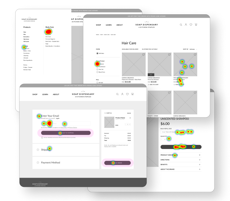
We built the limited functionality prototype in Figma to test with our target audience group and conducted a usability test to validate the design decisions early on before investing too much time and resources on the visual style and pixel perfect graphics, allowing us to make iterations early in the design.
Method
Remote, moderated usability testing using Useberry as the tool.
Participants
10 participants, between the age of 25 – 35 years old.
Test Scenario
Purchase a refillable shampoo from Soap Dispensary’s website and complete the entire checkout process and have the item delivered to your address.
Test Results
9 out of 10 participants successfully completed the task with a relatively low mis-click rate in an average time span of 4m 30s.
Test Insights
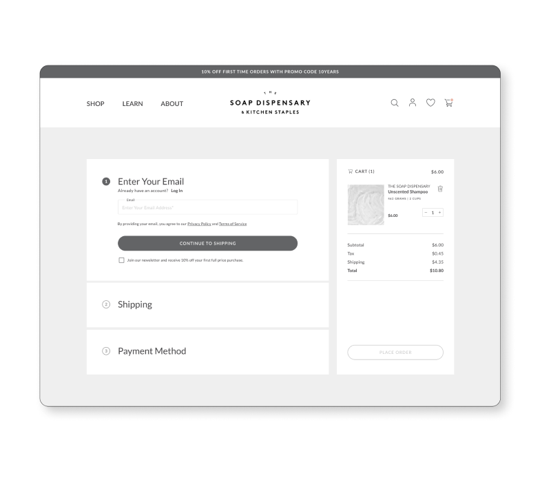
After analyzing the heat maps and synthesizing participant comments, we concluded that the revised user-flow and overall design was intuitive and accessible. However, we did discover that similar visual style of the ‘Place Order’ and ‘Shipping’ buttons in the checkout pages created valid confusion. We iterated to eliminate the discrepancy by updating the ‘Place Order’ button to appear in a disabled state until the final step of the checkout process was completed.
05. DELIVER
Visual Design
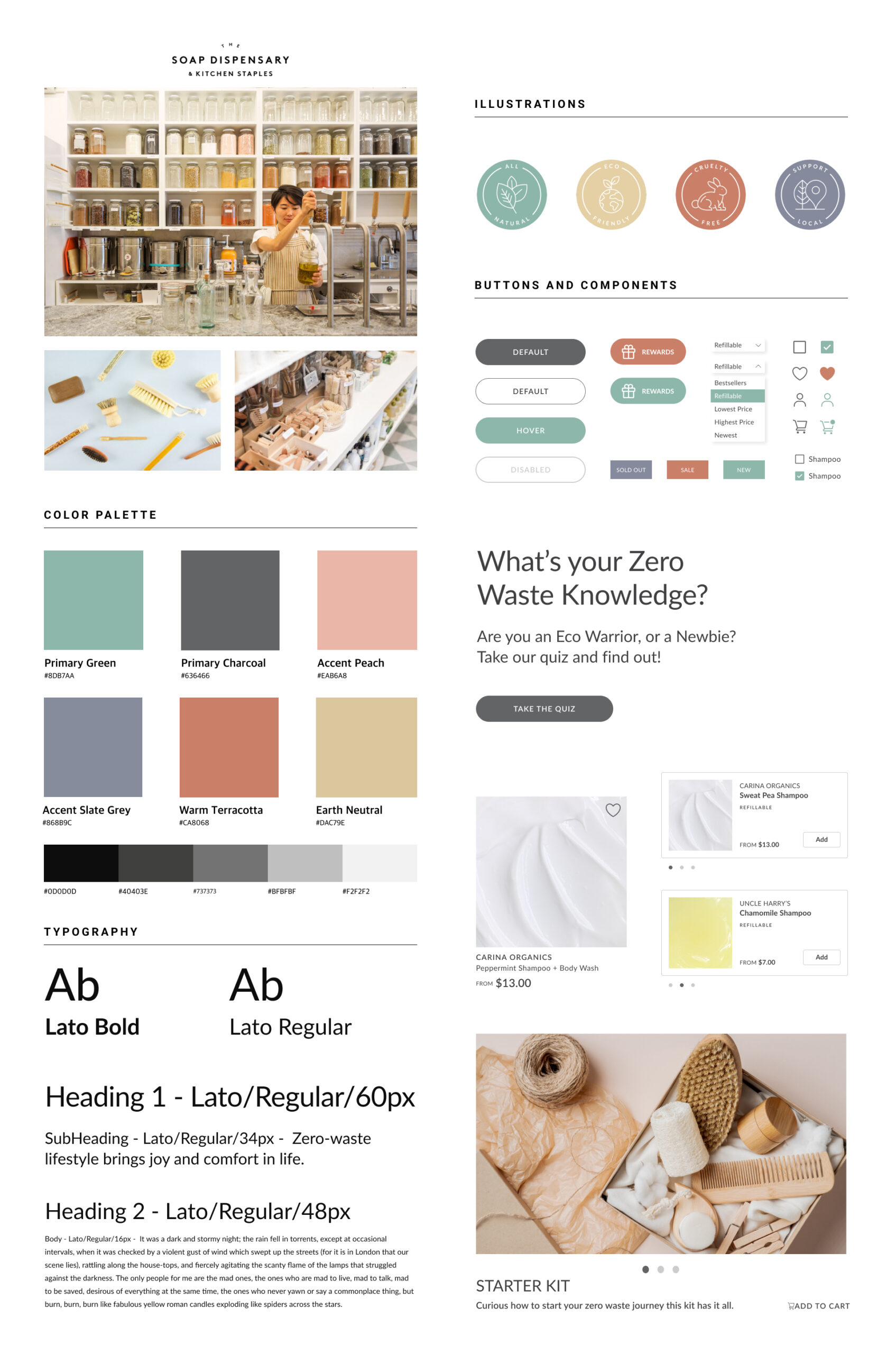
The primary goal of the project was to accentuate the functionality of The Soap Dispensary’s website while adding to the impactful narrative they intended on for higher customer engagement and satisfaction. Therefore, we were intentional with our choice of colours and textures and kept them in alignment with current Soap Dispensary’s branding.
Accessibility
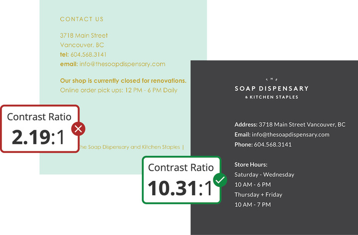
We improved on the overall typographic scale and colour contrast for better legibility and pleasing visual style as the current website had major accessibility issues, especially with the footer area. We redesigned the footer to have a 10.31 rating as compared to the initial rating of 2.19 (checked using Web AIM) that now meets WCAG AAA requirement.
High Fidelity Walkthrough
06. REFLECTION
Key Learnings
01. Align customer and business goals as early as possible, while removing biases by testing and validating hypothesis and assumptions to redefine the problem statement.
02. Focus on developing the Minimal Viable Product under time constraints and actively discuss and collaborate to get multiple perspectives and insights into the process.
03. Customer Experience Map was the most valuable tool for me to visualize the overall experience of a potential customer as they interact with the product with a definitive goal and to identify frustrations that then lead to design solutions for improvement and optimization. I would like to learn more about Journey and Experience maps to utilize in future projects.
Next Steps
I would spend time on expanding the MVP with further research and designing the ‘Learn’ and ‘About’ sections of the Soap Dispensary website to add more value to the product and develop a rich and complete experience for customers. I would then test for improvement and validation with suitable iterations followed up with the final step of designing the mobile version of the website and gathering experience to implement in the future projects.

